Daniel Approached me around August last year wanting to re-design and update his CV. Originally the brief that was given was to create a simple, 2-sided layout, as you would expect.
Skills and Software involved:
- Layout
- Typography
- Printing
- InDesign
- Photoshop
Daniel Harvey CV 2010 (Daniel’s old CV)
I am not suggesting that these CV’s should be copied, I need something more subtle and professional looking but they are worth a look.
– Daniel

In our preliminary discussions via email, he provided me with these examples, as well as his current CV and project booklet. He asked me to come up with some ideas, an estimation of time and cost and then get back to him. After some thought, I decided to propose going for a Bauhaus style. I sent over some images to him and my thoughts.
As for style, what immediately came to mind (or heart), was Bahaus. I think the red/black work well with each other to both grab attention and convey professionalism. I think that navy blue, shades of gray and green could also be possibilities. It really depends what ‘feeling’ you want to communicate. I have attached a few examples to illustrate my thought, I will not be giving a literal interpretation of this style, but will take inspiration from the layout, colour and typography. We can tweak it endlessly until you are 110% satisfied with it.
– Joe


To which Daniel responded with:
I love the Bauhaus idea that is genius I particularly like the first two posters you attached. I like the idea of red and black but not stark black and bright red as this is quite ‘engineering’ and can look quite hard. The Bauhaus seem to use a more cherry red with a slightly off black black to reduce the starkness. I agree the introduction of other colours could be interesting.
– Daniel

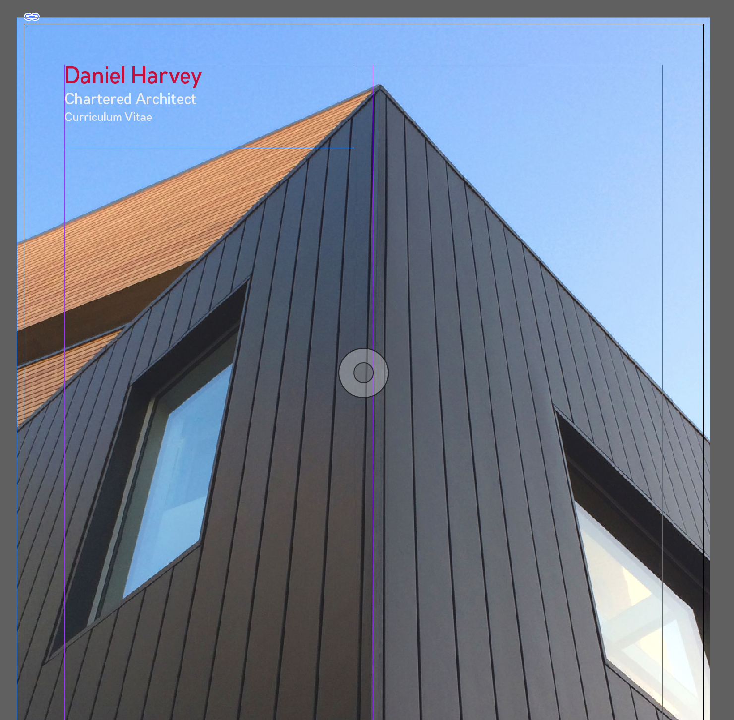
I quickly put together this design to get the ball rolling.
Working with Daniel was highly enjoyable, yet unexpectedly challenging. As an architect, he was very precise and picky about what he wanted. It took a great deal of time and reflection before we even started to get close to something that we were both happy with.
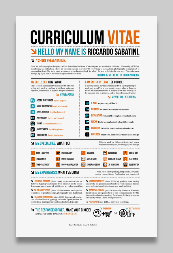
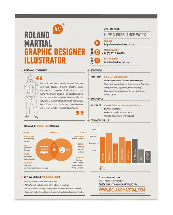
I have very specific ideas with what I would like, and have found some examples of well-designed CV’s that I have found on the internet. However I am open to any suggestions. The CV’s I have found are for graphic designers. Obviously being an architect I will need a different feel and extremely professional and clear and impressive design and layout and choice of colours. The examples will help as a starting point and it can evolve from there. I need to come across as a strong designer as well as a strong team leader and experienced architect and this need to be seen in the first 6 seconds of someone receiving my CV!
– Daniel
My deadline for the presentation to the university for this project is next Monday so after that I intend to work on the CV. However I have has a few ideas just now. Previously I created a cv booklet that contained a CV plus a mini portfolio with examples of my work with a cover letter presented in a top quality envelope. This proved very successful and I wish to do something similar.
However I was wondering whether a better approach would be to create a standalone CV which was a double sided piece of thick quality card (I will get this printed professionally) where the design of the CV ran from front to back with key lines, block of colour etc lined up on both front and back. Do you know what I mean? Someone will hold it and think how clever this is… (lets employ the fellow)
The mini portfolio of work will be a separate thing that can follow the same design principles as the CV.
Also I was thinking about colour. I still love the Bauhaus idea but I have been been a fan of red and black. The company I work for now is red and black and it just doesn’t work.
– Daniel
RIBA Journal (PDF)
He provided a page from the RIBA Journal (linked above) to give me a better idea for the colour, style and layout for the CV.
Here’s another image to illustrate:

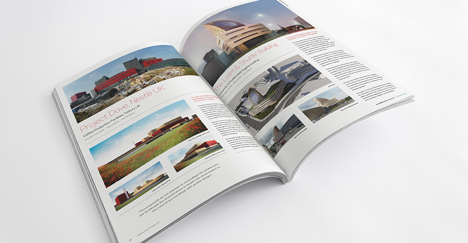
So as we can see, there is a lot of white space, the imagery becomes the focus and the typography is simple, crisp and clean. At this point we were beginning to think about a project booklet, rather than just a CV by itself as Daniel had a large amount of projects that he wanted to present to his potential employer, all in the same place.
Projects 2010-2013 (PDF) Here is the original project booklet that he was using.
It was at this point I realised I was not just designing a CV. I had misunderstood the original emails that had been sent to me. I thought that we were going to have a couple of projects from the booklet on his actual CV, but as things developed we decided it would be much more effective to have them in a separate section. This would quite literally ‘add weight’ to his CV.
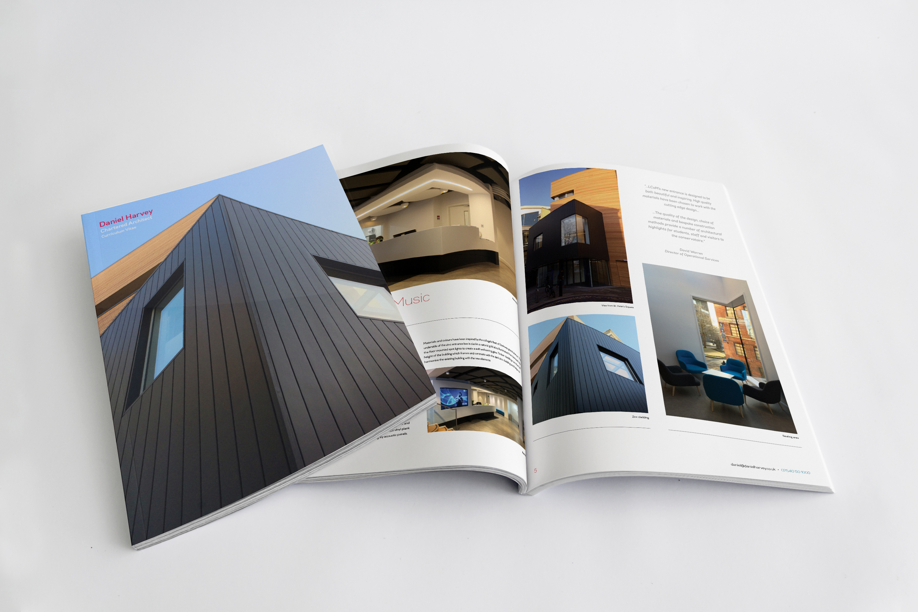
From this point I started to re-work the CV with different colours and a much lighter style that was more similar to the RIBA Journal that he provided me with (I also had a physical copy of it temporarily to find inspiration and guidance from).
Project Booklet Draft
I also started drafting the project booklet at this point, in-line with the new style that I was developing for the CV. I sent over the mockup example above to collect feedback.
You are a master.
I will look at it properly tomorrow but at first glance I love what you have done and so does lilley.
Glorious man.
– Daniel
He then sent over some visual feedback at a later date:
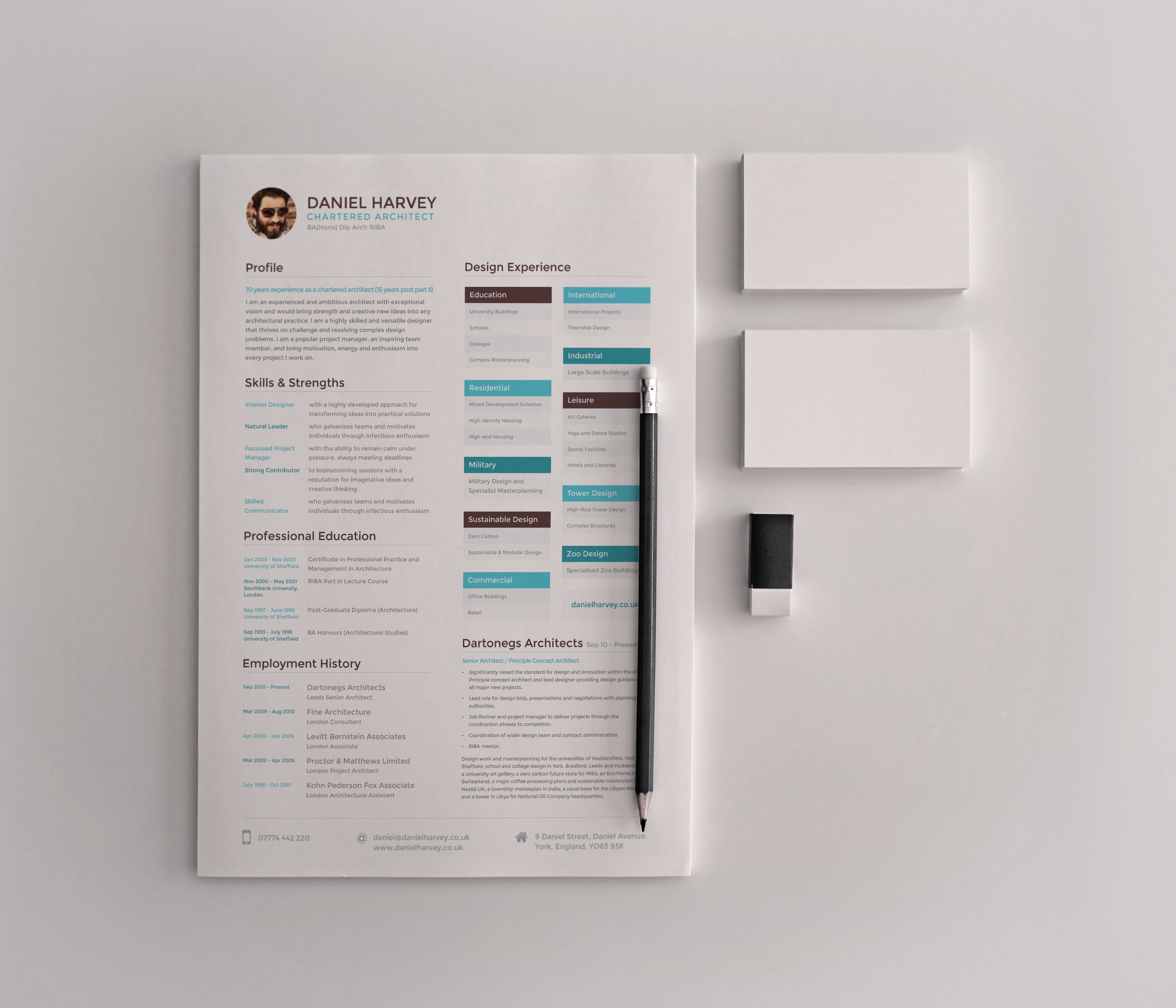
Up to this point, I was still working on the CV in Photoshop. This presented more problems than it solved. I had been avoiding using InDesign as I didn’t have much experience with it. I decided that now was the time to learn. I started re-building the CV in InDesign.
CV 1 (InDesign PDF)
I mailed this over to Dan who came back with:
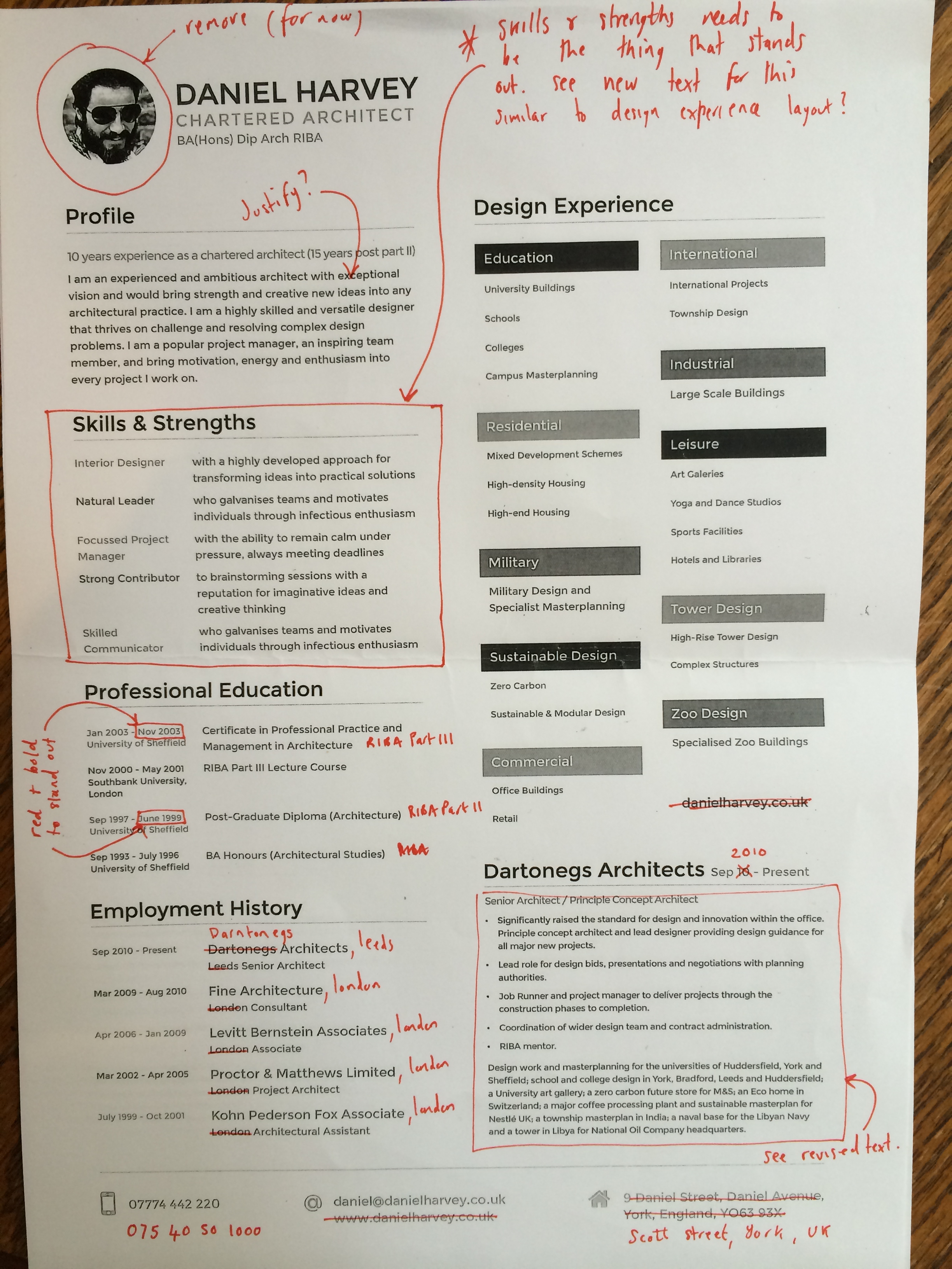
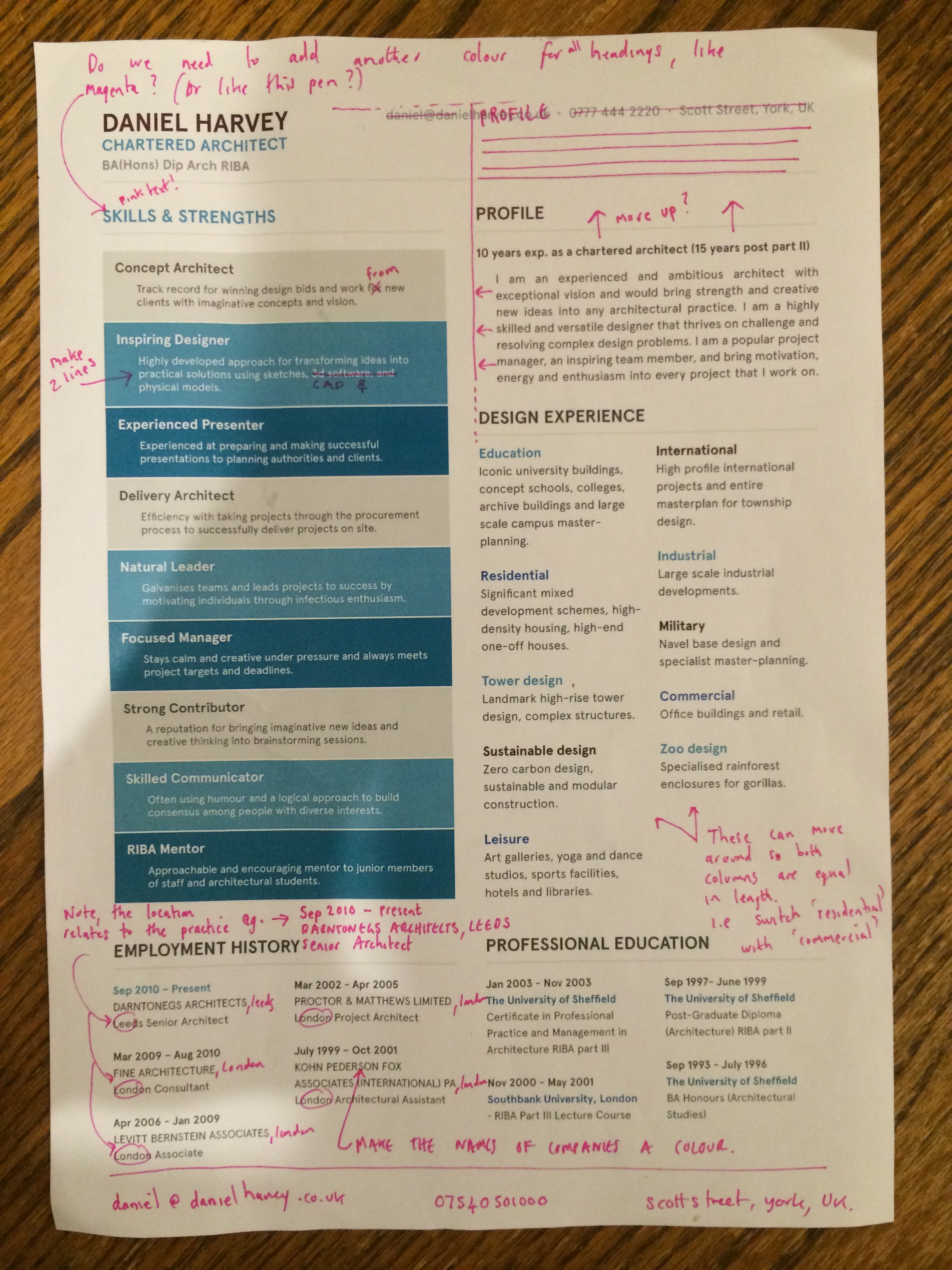
Joe, each time you send an update it looks better and better. This looks great. Please find some initial comments attached.
I am wondering if we need another colour like fuchsia pink for the main headings?
Also what would it look like if we shuffled it all up on the right?
Is this in InDesign now?
Thanks
– Dan
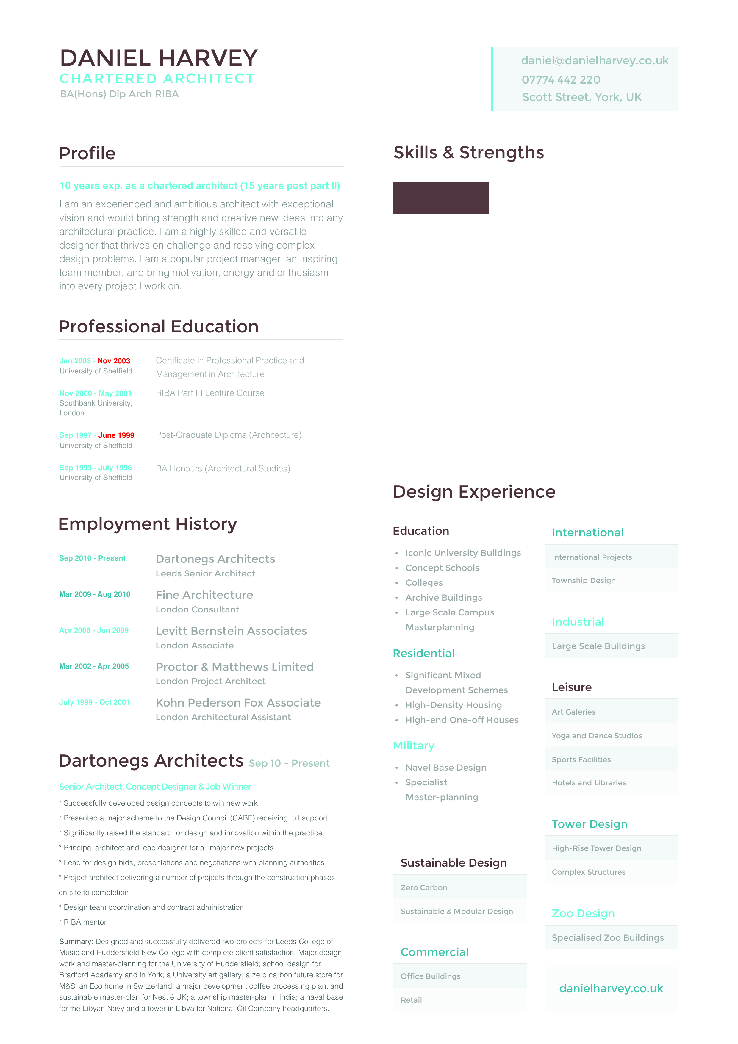
I made some more changes:
CV 2 (InDesign PDF)
Needs designing as 2 pages together possibly with colour running over both pages?
· Only needs ‘daniel harvey chartered architect’ on fist page
· Remove blocks of text on second page to give more space. Use the text left over to set ourt and I will refine text over the weekend.
· Only need address and details at bottom of each page
– Dan
By now we were starting to get somewhere. The working relationship was developing well and we seemed to understand each others ways of doing things, there was no friction at any point.
After a lot more pinging ideas and designs back and forth, we ended up with this. The style started to change quite dramatically when developing the project pages, which then influenced the CV pages. We were now starting to lean much more towards the style of the RIBA Journal.
CV & Project Booklet Development
Hello joeJust seen and love it!! Keep going, nearly there!Will call tomorrow morning?Sent from my iPhone


Final Revision